![[IOS] UIButton.Configuration을 사용해서 버튼 커스텀하기](https://img1.daumcdn.net/thumb/R750x0/?scode=mtistory2&fname=https%3A%2F%2Fblog.kakaocdn.net%2Fdn%2Fds4Tgx%2FbtrEc4wPWvq%2Fxs458Hj9zFj9nMy43ajV80%2Fimg.png)
팀 프로젝트로 만들었던 앱의 UI를 변경하다가 게임을 시작하기 위해 눌러야 하는 준비 버튼이 너무 작아서 눈에 잘 띄지 않는다고 생각했다. 그래서 버튼의 외관(Appearance)를 변경하려다가 IOS 15에서 새로 생긴 Configuration을 사용해보고 싶었다. 기존 메소드를 사용해서 설정하는 방법과 다른 점이 꽤 있어서 관련 내용을 포스팅한다. 내가 주로 사용한 설정값을 위주로 설명한다.
Configuration을 초기화하기 위해서는 아래 4가지 메소드 중 하나를 사용한다.
- UIButton.Configuration.plain()
- UIButton.Configuration.tinted()
- UIButton.Configuration.gray()
- UIButton.Configuration.filed()
말로 설명하는 것보다 직접 눈으로 보고 이해하는게 훨씬 쉽다.
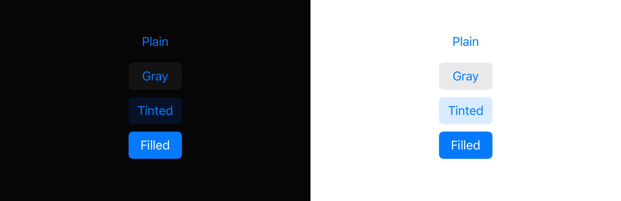
Configuration을 초기화할 때 위 4가지 탬플릿 중 하나로 초기화하는데 눈에 띄는 부분은 배경색과 글자색의 차이이다.
Configuration의 여러 프로퍼티를 수정해서 타이틀, 배경색, 테두리, 이미지, 동작 등을 많은 요소들을 커스텀할 수 있다.
만약 버튼에 Configuration을 적용한 상태에서 titleLabel의 font를 수정할 경우 아무 변화도 일어나지 않는데, 그 이유는 UIButton 내부에는 Configuration외에 버튼 설정을 도와주는 여러 메소드와 프로퍼티들이 존재하기 때문이다. 둘을 모두 사용해도 상관없지만 어떤 설정에서 어떤 값이 우선으로 적용되는지 명확하지 않다.
내가 커스텀에 사용했던 Configuration의 주 프로퍼티는 크게 3개의 그룹으로 나눌 수 있다.
- Contents
- Appearance
- Behavior
1. Contents
이 그룹에서는 title, subtitle, image 프로퍼티를 주로 사용한다.
이름에서도 유추할 수 있듯이 버튼 내부에 들어가는 내용들을 커스텀할 수 있다.

title과 subtitle의 텍스트를 변경하고 image 프로퍼티를 사용해서 원하는 이미지를 넣을 수 있다.
글자색 또는 폰트를 변경하고 싶으면 attributedTitle과 attributedSubtitle 프로퍼티를 사용한다.
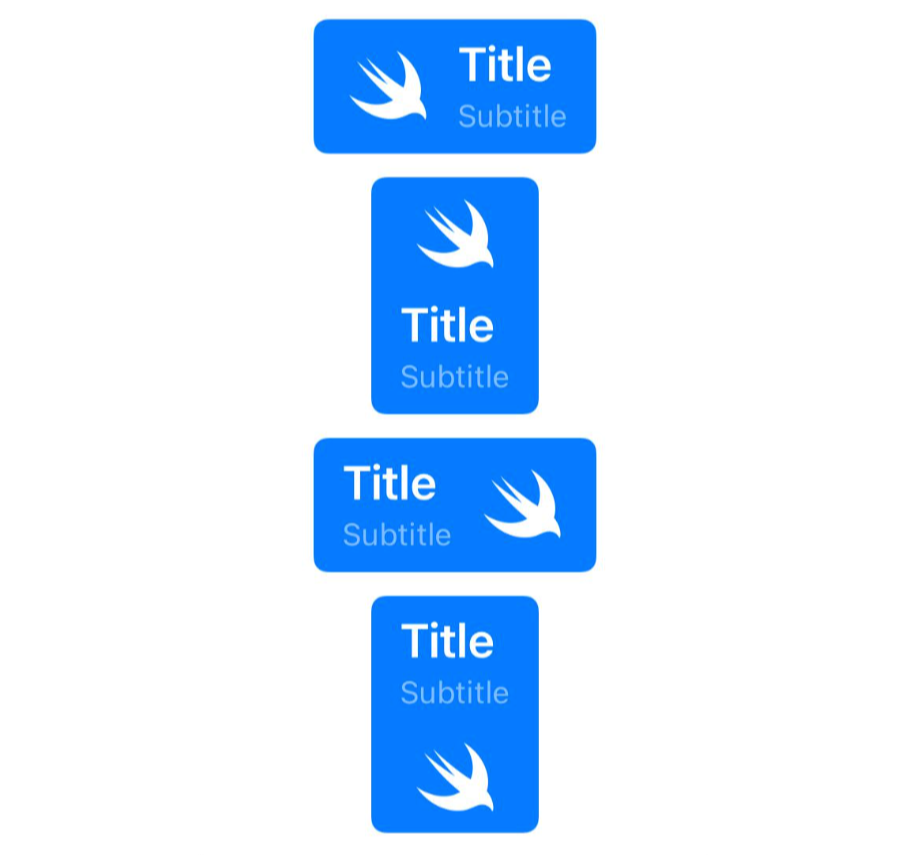
이미지의 위치뿐 만 아니라 텍스트의 정렬 방향, 타이틀과 이미지 사이의 padding 또는 버튼과 내부 content 영역 사이의
inset을 설정할 수도 있다. 아래 코드로 커스텀된 여러 개의 버튼을 비교해서 보면 조금 더 이해하기 쉽다.
var configuration = UIButton.Configuration.filled()

var titleContainer = AttributeContainer()
titleContainer.font = UIFont.boldSystemFont(ofSize: 20)

var subtitleContainer = AttributeContainer()
subtitleContainer.foregroundColor = UIColor.white.withAlphaComponent(0.5)

// 버튼 Contents 커스텀
configuration.attributedTitle = AttributedString("Title", attributes: titleContainer)
configuration.attributedSubtitle = AttributedString("Subtitle", attributes: subtitleContainer)
configuration.image = UIImage(systemName: "swift")
configuration.preferredSymbolConfigurationForImage = UIImage.SymbolConfiguration(pointSize: 30)
configuration.imagePadding = 10

// 이미지가 왼쪽에 위치한 버튼
configuration.titleAlignment = .leading
let leftButton = UIButton(configuration: configuration)

// 이미지가 상단에 위치한 버튼
configuration.imagePlacement = .top
let topButton = UIButton(configuration: configuration)

// 이미지가 오른쪽에 위치한 버튼
configuration.imagePlacement = .trailing
let rightButton = UIButton(configuration: configuration)

// 이미지가 하단에 위치한 버튼
configuration.imagePlacement = .bottom
let bottomButton = UIButton(configuration: configuration)
2. Appearance
버튼의 색, 크기, 배경, 테두리 등 버튼의 외관을 결정하는 값을 커스텀할 수 있다.
주로 사용하는 프로퍼티는 buttonSize, background, cornerStyle이 있다.
buttonSize와 cornetStyle에 따른 버튼의 형태은 아래와 같다.


- CornerStyle의 fix와 dynamic
fix는 둥근 모서리를 그릴때 버튼의 configuration.background.cornerRadius 프로퍼티에 저장된 고정값을 사용하는 설정이고,
dynamic은 기기에 설정된 텍스트 크기값에 따라 cornerRadius 값을 동적으로 변하게 만드는 설정이다.
※ 설정한 buttonSize는 내부 Contents의 설정값에 따라 재정의될 수 있다.
즉, 버튼의 크기를 작게 설정했더라도 버튼의 이미지와 타이틀 크기에 따라 변경될 수 있다.
background 프로퍼티는 UIBackgroundConfiguration 타입으로 버튼의 배경을 커스텀할 때 사용한다.
내부의 대표 프로퍼티로는 cornerRadius, backgroundColor, strokeColor, strokeWidth 등이 있다.
- cornerRadius: 버튼의 모서리가 둥근 정도
- backgroundColor: 배경색
- stokeColor: 테두리 색
- strokeWidth: 테두리 굵기
- backgroundColor와 baseBackgroundColor의 차이점
baseBackgroundColor에 설정된 색상이 그대로 버튼의 배경색에 적용되는 것은 아니다.
그 예시로 plain과 tinted로 설정된 버튼에 해당 프로퍼티의 색을 변경할 경우 plain은 투명한 배경을, tinted는 설정한 색이 투명하게 보인다. 즉, base라는 단어에서도 볼 수 있듯이 이 프로퍼티에 설정한 색이 버튼에 적용되기 전에 변형이 일어남을 알 수 있다.
3. Behavior
버튼의 상태에 따른 행동을 커스텀할 수 있다.
나의 경우 준비 버튼을 눌렀을때 배경색이 변하게 만들고 싶어서 ConfigurationUpdateHandler를 사용했다.
button.configurationUpdateHandler = { button in

            var container = AttributeContainer()
            container.font = .systemFont(ofSize: 20, weight: .bold)

            var configuration = button.configuration

            switch button.state {

            case .selected:
                container.foregroundColor = .white
                configuration?.background.backgroundColor = .systemBlue
                configuration?.attributedTitle = AttributedString("준비 완료!", attributes: container)
            case .highlighted:
                break
            default:
                container.foregroundColor = .black
                configuration?.background.backgroundColor = .systemGray6
                configuration?.attributedTitle = AttributedString("준비", attributes: container)
            }

            button.configuration = configuration

        }
버튼을 누르면 isSelected가 true가 되어 selected 상태로 만들고 위 클로저를 호출하여 내부에서 버튼의 배경색과 타이틀을 변경한다.
버튼을 다시 한번 누르면 isSelected가 false가 되고 버튼의 상태가 normal이 되어 원래 설정값을 갖도록 한다.
참고 문서
https://sarunw.com/posts/new-way-to-style-uibutton-in-ios15/
A new way to style UIButton with UIButton.Configuration in iOS 15 | Sarunw
The first part in the series "What's new in UIKit button". An introduction to a new button configuration, a struct that is shaping and styling your button. You no longer need to subclass UIButton ever again with button configuration.
sarunw.com
https://gyuios.tistory.com/126
iOS) UIButton.Configuration in iOS 15
iOS 15 에서 UIButton 에 새로생긴 UIButton.Configuration 에 대해서 알아보자! 먼저, 개발자문서를 따라가면서 버튼을 만드는 방법에 대해서 알아보자. Creating Buttons ✨ init(frame: CGRect) Creates a new..
gyuios.tistory.com
'IOS' 카테고리의 다른 글
| [IOS] 스플래시 화면과 다크모드 대응 화면 만들기 (0) | 2022.07.16 |
|---|---|
| [IOS] 뷰에 그림자 만들기 (0) | 2022.06.09 |
| [IOS] 웹소켓을 사용한 클라이언트 시간 동기화 방법과 문제점 (0) | 2022.05.19 |
| [Xcode] App Build 없이 Simulator 실행 및 기종 변경하기 (0) | 2022.05.16 |
| [IOS] Socket.IO를 사용한 Node.js 서버 연결 실패 이슈에 대하여 (0) | 2022.04.05 |